In this week’s newsletter, I’m going to show you how you can use a graph to catch the attention of your prospects, and get replies.
Great prospecting is about starting conversations, and to do that, you need to get replies. Using a graphical representation of a problem is a simple way to stand out, and start a conversation.
Unfortunately, most SDRs I meet do not know how to represent their prospects’ problem visually.
They don’t do it because they have no idea what problem they are solving for their customers.
When reaching out to prospects, SDRs typically:
But don’t worry, I’m going to show you exactly how to stop doing that.
Here’s how, step by step:
Step 1: Identify a key problem of your prospect
Prospects typically reply to cold outreach when they think you can solve a problem for them. The best way to show your understanding of a problem is to write about symptoms.
For example, I talk to a lot of VPs of Sales and CROs. They are evaluated on their forecasting accuracy. If their team’s performance is way off for a few quarters in a row, their jobs are on the line.
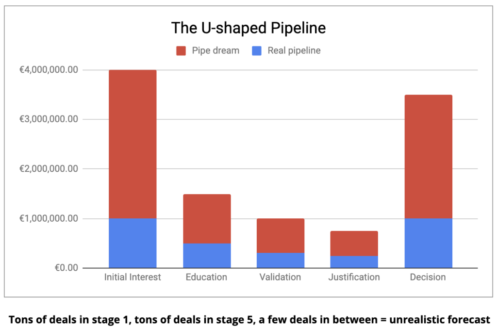
An early indicator of a forecasting accuracy gap is a U-shaped pipeline. The team has a lot of early-stage opportunities, a lot of late-stage opportunities, but a lot less in between.
Step 2: Create a visual representation of this problem
Now that I have a clear idea of the symptoms I want to focus on, I’ll create a visual representation of the problem.
I like using pie charts or column charts as they are simple ways to represent data.
In my example above, I’ll open an Excel spreadsheet, create 5 sales process stages, and add some dummy data to reflect the problem. I then end up with a graph like the one below:

The graph above reflects the symptoms I identified in step 1. It is a common sight for VPs of Sales and CROs when they’re looking are their CRMs.
Step 3: Add a caption
I like to add a short caption to show my understanding of the VPs of Sales and CROs problem. In the example above, it’s: “Tons of deals in stage 1, ton of deals in stage 5, a few deals in between = unrealistic forecast”.
When the VPs or CROs read the caption, they can immediately relate and see that I understand what they are going through. If they don’t have that problem, they won’t relate, but if they do, they may reply.
Step 4: Insert in your sequence
Finally, I love to introduce the graph with a short LinkedIn voice note, a video, or a quick text.
Here’s an example:
John, many sales leaders I’m speaking with have sales forecasts looking like this thing below (insert graph of typical u-shaped forecast). Tons of opps in early stage, tons of opps in late stage, nothing in between.
If this looks familiar, then I have 3 ideas on how you can solve the problem.
Want to learn more?
I’ve been running this play for a month and here are my stats at the moment of writing the play:
TL;DR:
And if you’re interested in receiving one play like this every month, go check The Monthly Prospecting Plays. It’s €9/month and you can cancel at any time.
Cheers,
Thibaut
Get my free, 4 min weekly newsletter. Used by 5.900+ salespeople to book more meetings and work when, where, and how they want.
Get my free, 4 min weekly newsletter. Used by 5.900+ salespeople to book more meetings and work when, where, and how they want.
I will never spam you, or sell your info.
Get each episode in your mailbox when they release. Grab special discounts and offers.